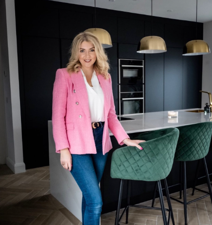
With a love of all things dark and moody, Laura Crowley has a very defined taste when it comes to interior design,
something she’s cultivated over the past number of years. Indeed, having decorated no fewer than three houses in
under a decade, she’s developed a keen eye for what looks good in a home and knows exactly what she likes. Together
with her husband, Ian, they’ve subsequently learned a lot about what works for them when designing a home – things
they were very conscious of when decorating their new house in Cork.
Documenting their interior design journey on her Instagram account, @third_homes_the_charm, Laura discussed the
couple’s latest project and how they approached styling it.

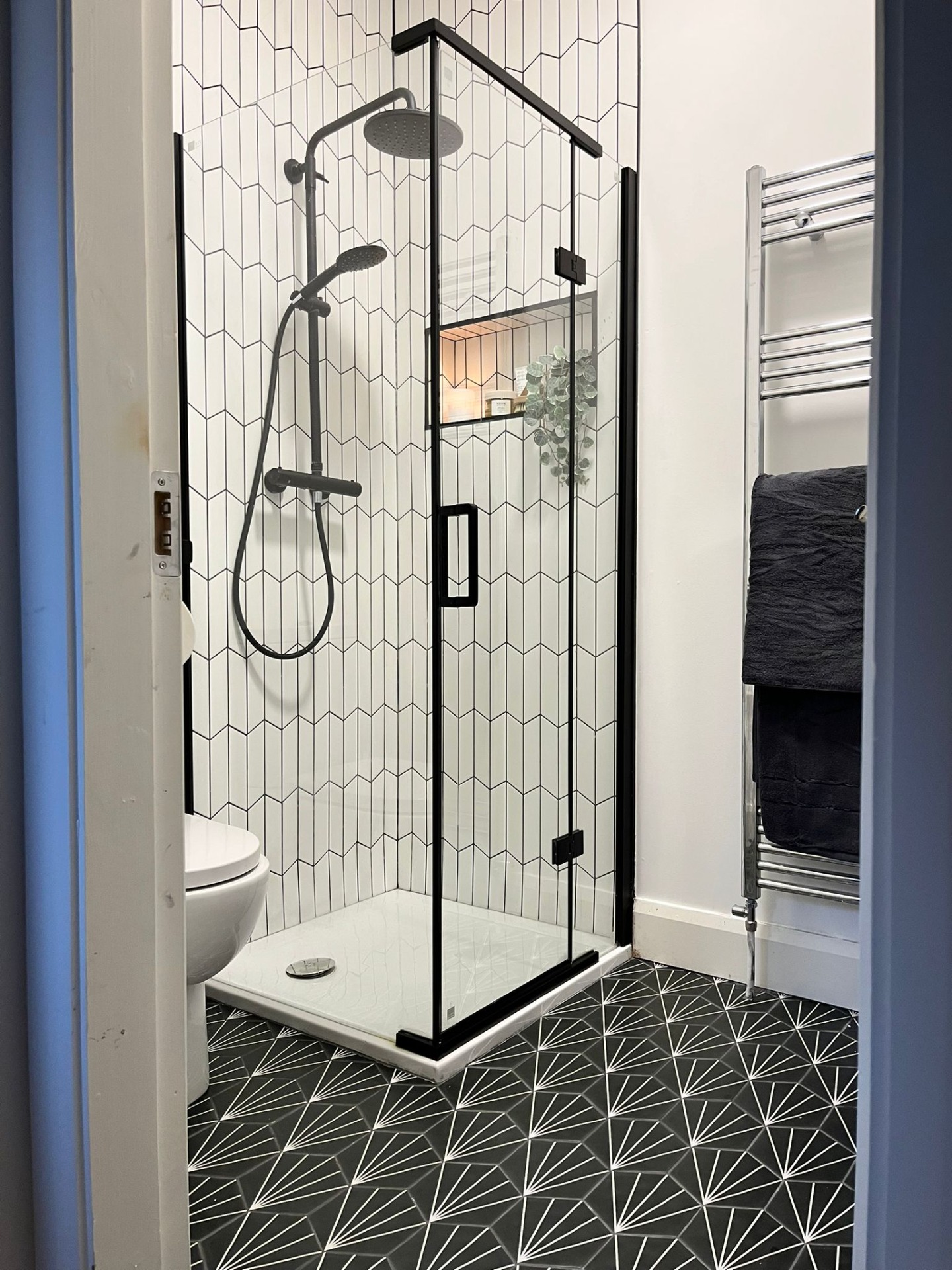
The ensuite with its striking monochrome look.
Timeless monochrome style for ensuite
Having moved into the new-build property before it was finished, Laura said the first priority was to have a fully
functioning bathroom. The ensuite was subsequently the first room they tackled.
“We bought a builder’s-finish house and took ownership of it on October 30, 2022,” she said. “The ensuite was the
very first room we sorted out because we really needed it. We’d been renting and were told the house would be ready
sooner, but we ended up being in the rental property for over ten months. We moved in with concrete floors and were
sleeping on mattresses on top of the underlay for the wooden floors upstairs. We had no running water in the kitchen
either, so it was a bit of a struggle at the start.”

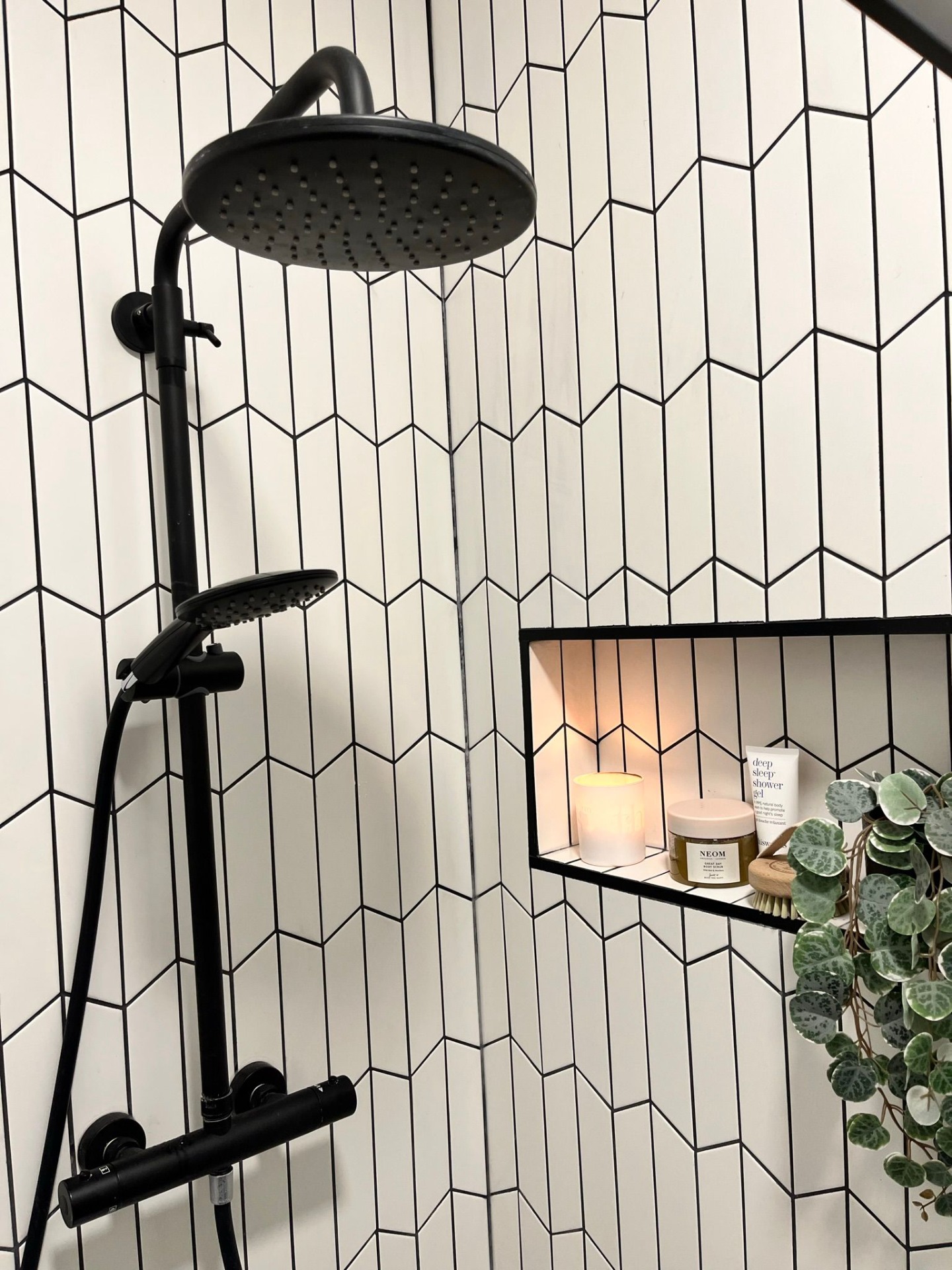
The Eliseo Ricci Noir Curve Plus Thermostatic Rain Shower in Matt Black.
With her daughters’ room located next to the main bathroom, Laura decided to convert the girls’ ensuite into
one for her and Ian, subsequently changing their own ensuite into a walk-in XXX
“There was no tiling, the showerheads weren’t to our taste and we had no vanity units,” she said. “So, we
got the tiling sorted and changed out the vanity unit. Ian wanted a monochrome bathroom and I was totally up
for that because I love dark and moody. Also, monochrome is timeless. We have black and white in there, with
a pop of colour with a bright red XX. There’s black grouting on the walls, too. The rest of the house is
dark and moody as well, with pops of colour. That’s my style.”

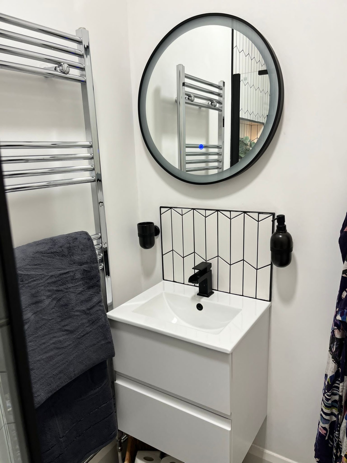
The Hudson Reed Urban Wall-mounted Vanity Unit.
The ensuite features a stylish monochrome shower which is the focal point of the room and what you see immediately
you enter the ensuite, with the shower screen Bathshack’s Noir Black Frameless Sliding Shower Door. This provides a nice contrast with the white
metro tiles and black grouting which run vertically up the shower enclosure walls.
The Eliseo Ricci Noir Curve Plus Thermostatic Rain Shower from Bathshack is also fitted
inside, with the rainfall showerhead ensuring a luxurious immersive experience. An alcove cut into the wall
subsequently provides a discreet space for storing toiletries.
“The shower door was the perfect fit for the bathroom,” said Laura. “It’s quite a small ensuite, so we didn’t tile
the whole thing. I’m not a fan of tiling the whole room because I change my mind too quickly. If I can paint a wall,
it gives it a different feel.”
The shower tiles complement the white shower tray and then create a striking contrast with the floor tiles, which
have a black base colour with a white striped design and white grouting. Next to the shower is a wall-mounted heated
towel rail in polished chrome, with the vanity unit – the Hudson Reed Urban Wall-mounted Vanity Unit and Minimalist Basin in Satin White from
Bathshack – positioned next to this. A round black-framed mirror then hangs above this, continuing the monochrome
aesthetic, while the shower tiling is used to create a small splash-back behind the basin.
The vanity unit has a sleek, satin white finish and comes with two deep drawers for storage, while the contrasting
mixer is Bathshack’s Eliseo Ricci Waterfall Mono Basin Mixer in Matt Black. It has a minimalist single-lever
design with an open spout, giving it a contemporary edge, while it also matches the black waste – the Eliseo Ricci Press-top Slotted Basin Waste from Bathshack.
Wood-effect herringbone tiles for downstairs
Having moved in without any flooring in place, another priority for Laura and Ian was to find their perfect
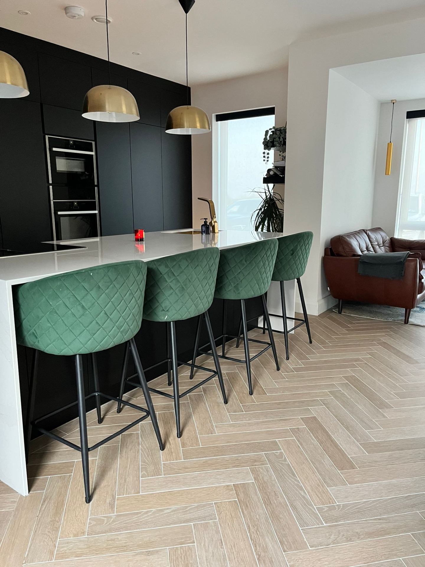
downstairs tiles, which were ultimately Bathshack’s Burdeos Wood Herringbone Porcelain
Tile in Wood-effect.

The Burdeos Wood Herringbone Porcelain Tile in Wood-effect.
“Everyone adores the tiles downstairs,” said Laura. “How nice they are and how natural they look – because
they do look like wood. It’s fab. We went with putting a border around the edges, which I think finished it
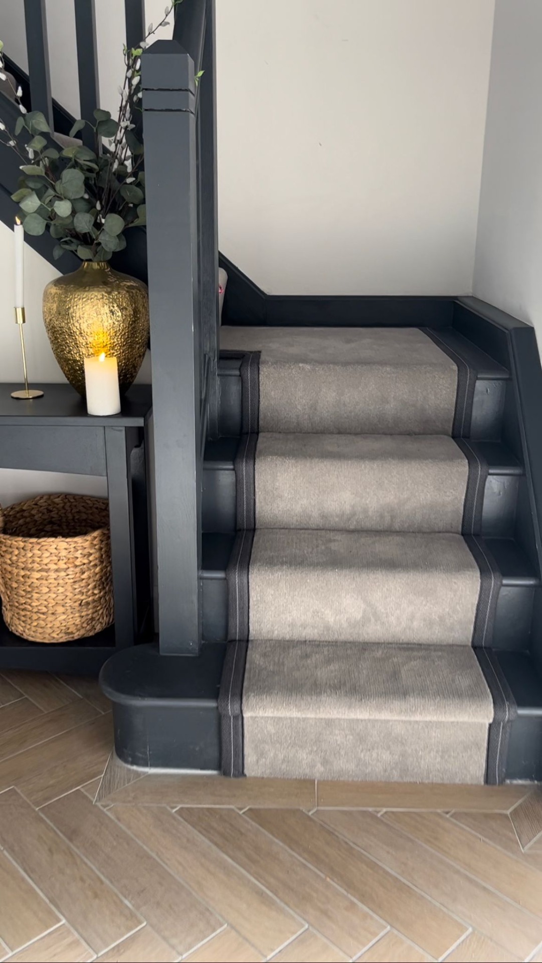
off really nicely. It looks fantastic and I love the fact that the tiling runs from the front door, into the
downstairs bathroom, utility room and kitchen. Every nook and cranny downstairs has that tile. It gives
continuation and flow and we also have underfloor heating, which makes it so cosy.”
Having known from the outset that they wanted all the downstairs flooring to be the same, Laura said this
was something they’d done previously, which was why they sought the same again. They were also very
conscious of the way the herringbone design was laid – as was their tiler – to ensure that the pattern drew
the eye down the hallway and into the living room – so everything was very well thought-out.
When it came to choosing the tiles, the couple initially acquired a selection of samples, comparing them at
different times of the day during site visits to see which would look best in both dark and bright lighting.
“We soon figured out that Bathshack’s tile was the perfect one,” said Laura. “It was ideal for all the nooks and
crannies. It was the perfect size too. We knew we wanted a small tile – intricate and not a big plank style – and we
were specifically looking for wood-effect in that size.
“Because it’s our third house, we thought of all the mistakes we’d ever made with anything and tried to learn from
those and build from them. The big thing was the flooring for us and I think it sets the tone for the entire house.
It just lifts the whole place.”

The herringbone tiles in the hallway.

Laura likes to mix quirky decor into each room.
Keeping it quirky and eye-catching
With this their third builder’s-finish house in eight years, Laura said they began with a terrace house, then moved
to one twice the size before moving into their now detached home. As for her specific interior design style, she
said her preference was for a mid-century modern fun look.
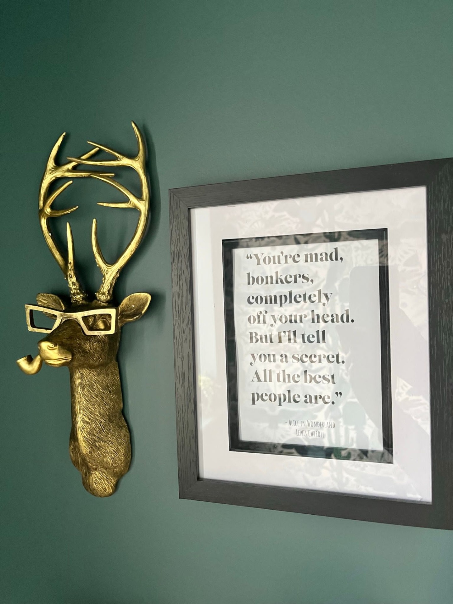
She added: “I have a motto – in every room there should be something new, something upcycled and something that
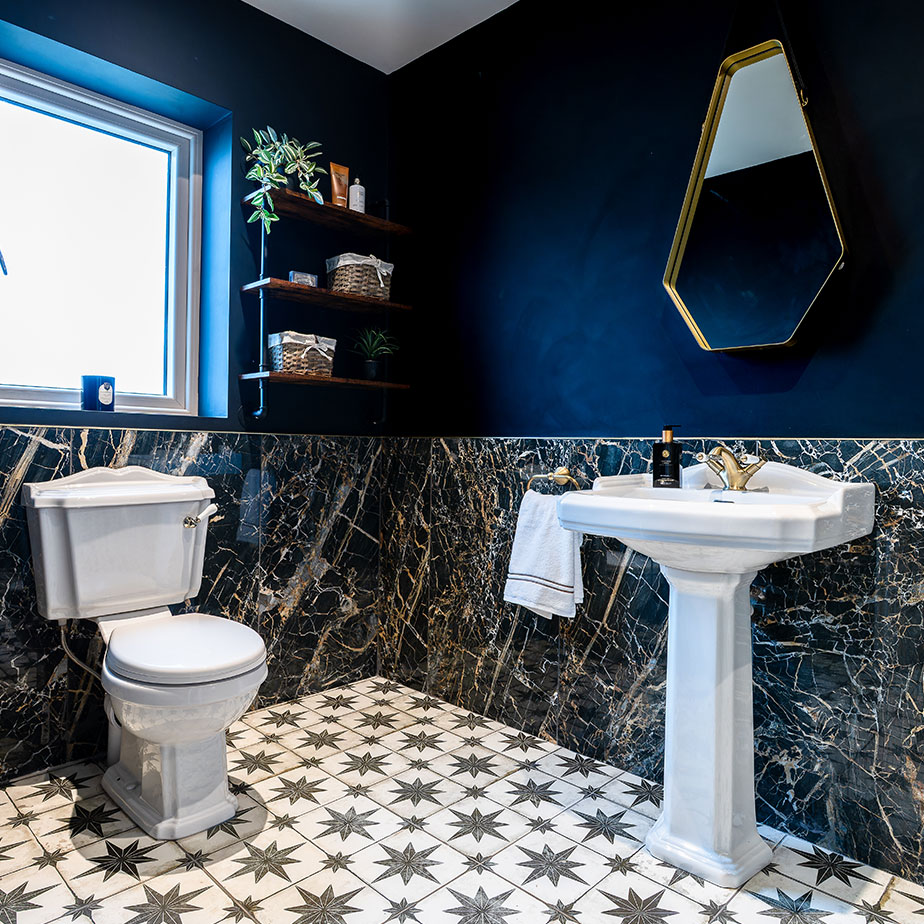
makes people go, ‘oh, what’s that?’ I love quirky bits and pieces. For example, I have a stag head wearing a monocle
in the downstairs bathroom. I like having a piece of art or an accessory that’s unusual. It doesn’t have to be huge,
just something that catches the eye.
“We’re also big on painting ceilings and colour-drenching. My living room is navy-black everywhere, with plush
velvet and cushions.”

Laura advises sticking to your preferred style when decorating your home and not just jumping on trends.
-
“Don’t ever decorate your house for other people. If you love the way your house is decorated, that’s
what matters when you close the door. I often see people try to jump on trends that aren’t really
‘them’. Always stay true to your own style.
-
“Think about the location of sockets and consider how many you need. Our kitchen island is in a
waterfall style – and I was adamant I didn’t want the stone cut for sockets. So, I put a black plinth on
either side of the reverse of the island, with USB points and sockets. Because it’s black it blends in,
so you can’t see them, but I have all the sockets I need.
-
• “Consider storage and the potential for ‘doom piles’ in kitchens: create as much space as you can for tidying
things away, rather than creating space that will collect things. In the kitchen we were adamant that both the
hob and sink would be on the island. So, my island is always clean in the evening. I have a place for
everything. We wanted clean lines and for everything to have a function and to be in the style we wanted.
-
“Think about function as well as style. What do you want the room to do? We’re a neurodivergent
household and I’m very noise-sensitive, so I wanted the back room to be very cosy and to dampen sounds.
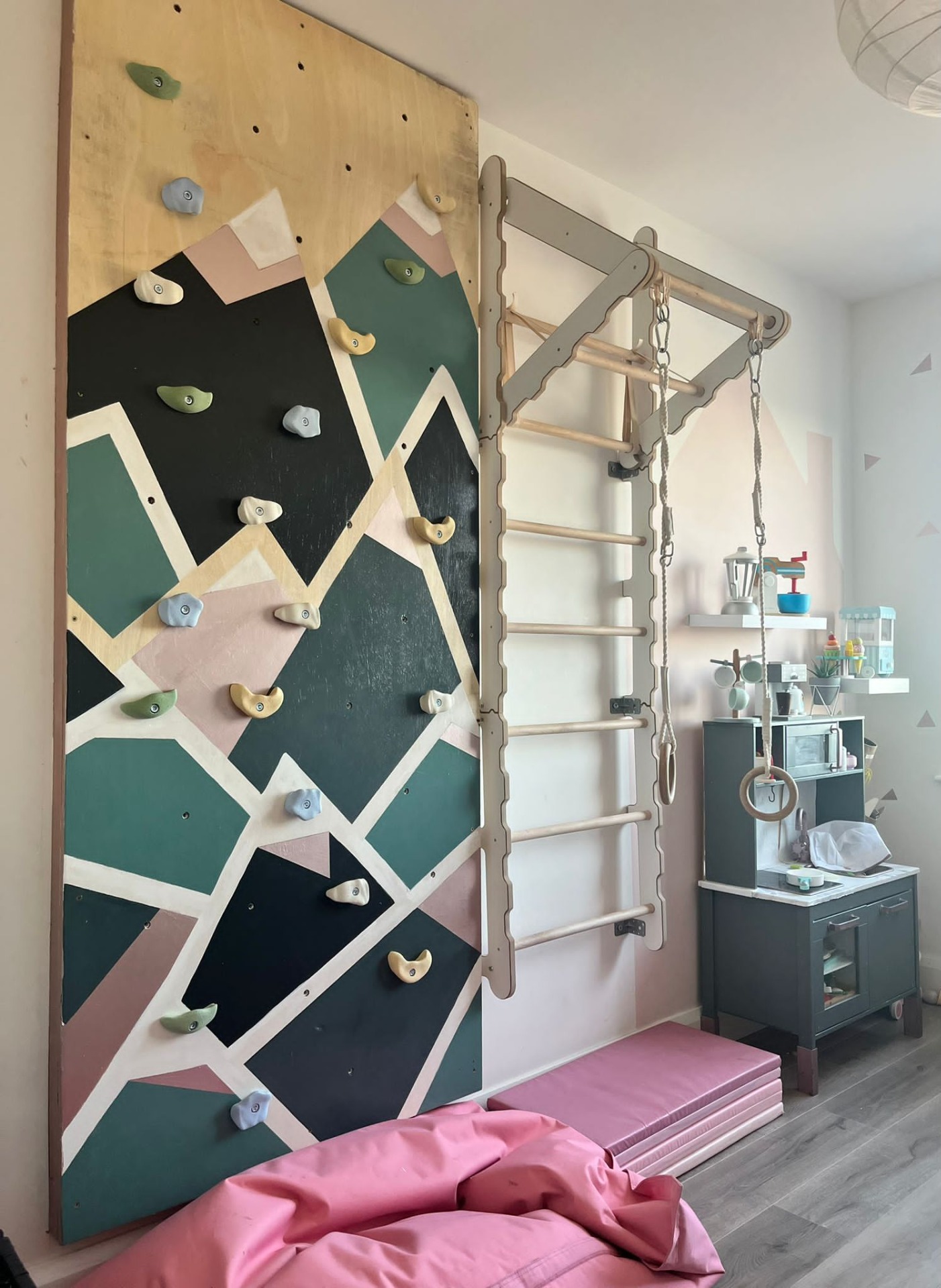
A room upstairs was also converted into a toy room with a climbing wall and frame for my daughter, who’s
very lively. Once I know what the room is to do, that impacts the style.
-
“Start with just one room. It can be overwhelming at the beginning but trust your own taste and do
your research. You can also do reverse-Google searches, where you search using photos of more expensive
items and then find similar, more affordable options online. There are definitely ways to get the effect
you want without the high price tag.”

The toy room, with climbing wall.
You can follow Laura on Instagram at @third_homes_the_charm
If you’d like some help with choosing products for your bathroom or ensuite, just email our team at info@bathshack.com or call us on (028) 9077 0188. Alternatively, our online chat is also available
if you have any queries.

