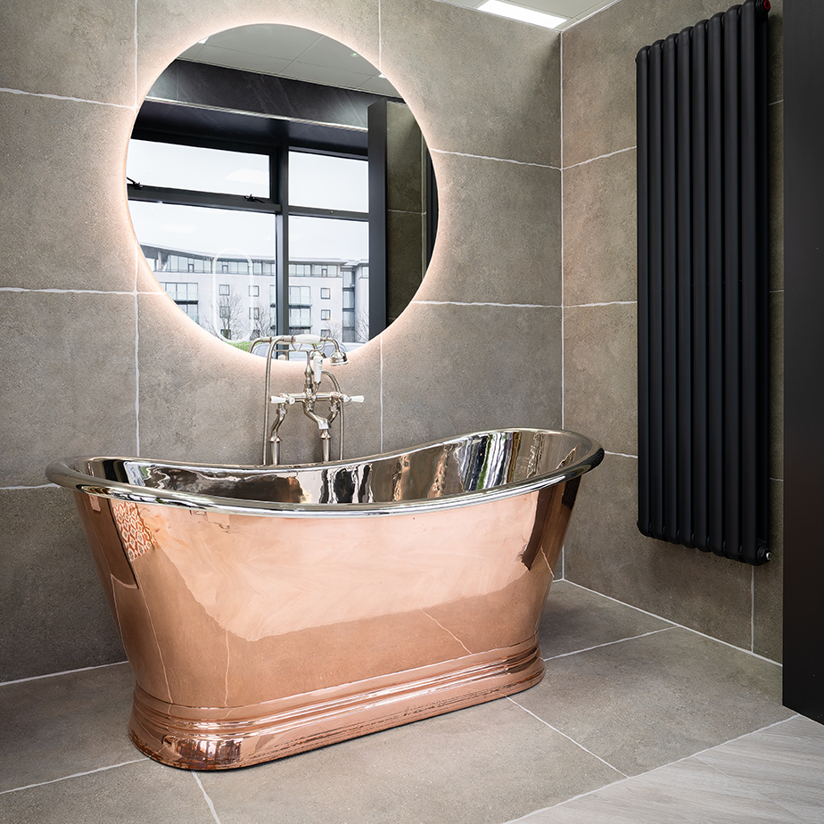
Case Study: Luxury Hotel vibe Cork
With calming stone-effect tiles, warming wood details and matt black accents combined with a luxurious freestanding bathtub and double walk-in shower, the bathroom in Kitti and Shaun's Cork home is something reminiscent of a spa or boutique hotel. Indeed, this is exactly the look they were aiming for when they renovated the space, ripping out the existing bathroom-ware and refitting it with furniture which better suited their tastes.
Having chosen a fair few of Bathshack's products for this impressive space, we subsequently had a chat with Kitti to find out more about how the couple created their dream interior...

Shaun and Kitti opted for a luxury hotel aesthetic for their bathroom renovation.
Natural-themed colour palette
When it came to renovating their new home, which Kitti and Shaun moved into in October 2022, the couple began by tackling the downstairs first, before working their way up to the bigger bathroom project.
“We were very eager to move into the bungalow straight away, but it was very outdated, so we got down to work,” said Kitti. “We were always on a budget, so we tried to do as much as could by ourselves and with help from friends and family.
“The previous owners had already done up the kitchen, so we started in the living room because we would be spending a lot of time in there. We did all the painting ourselves and then moved onto the bedroom.”
Opting for a neutral colour palette in the living room, this is replicated throughout the rest of the house, with the couple also replacing the small square rustic wall tiles in the kitchen with more modern white metro-style tiling. They also went with a similar aesthetic in the bedroom and bathroom, to create a tranquil, relaxing vibe.
“We have fitted wardrobes in the bedroom, which I wasn’t sure about because they’re also quite outdated,” said Kitti. “They were more of a yellow beige before, so I decided to paint them. I also changed the handles from silver metal to gold. It just brightened up the room and made a big difference.”
The result is a welcoming space, with warming brass accents used in lights and other fittings, a chandelier-style overhead light adding a touch of opulence and again, tying into that boutique hotel aesthetic.
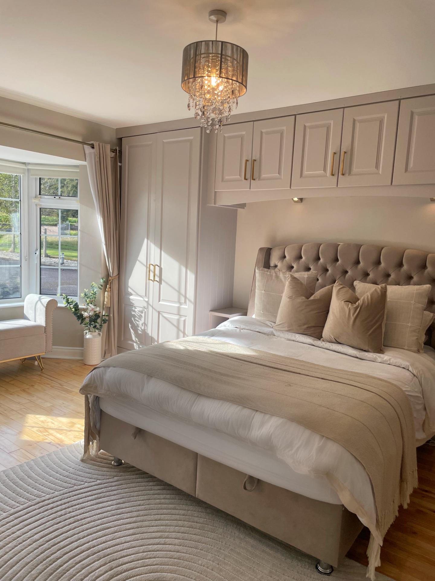
The couple's bedroom continues the neutral theme of their home.
Luxury spa-like style for bathroom suite
It was the bathroom, however, where Kitti and Shaun did the most work, replacing the entire suite with their own bathroom-ware and creating the perfect spa-like space where they could relax and unwind. While the plumbing remained as it was in terms of where items were situated, everything else changed, with the couple swapping a small corner bath for a more luxurious freestanding tub and replacing a single shower with a spacious double walk-in design.
“The original corner bath looked really big but when you were in it, it wasn’t big at all,” said Kitti. “Me and Shaun have always been keen to get a freestanding bath and we knew we wanted neutral tones as well, so we had a good idea of how it was all going to look. We shopped around in Cork and looked online, too.
“We knew we wanted something neutral but not too grey – something with warmth in it. That’s why, when we went into the showrooms in Cork and I saw the wood-effect tiles, I fell in love. They were literally the first thing I saw. We looked around and took photos, so we could go home and think about it all, because it’s a big decision. We then went with the wood-effect tiling for the vanity area and the main grey tiles for the rest of the room.”
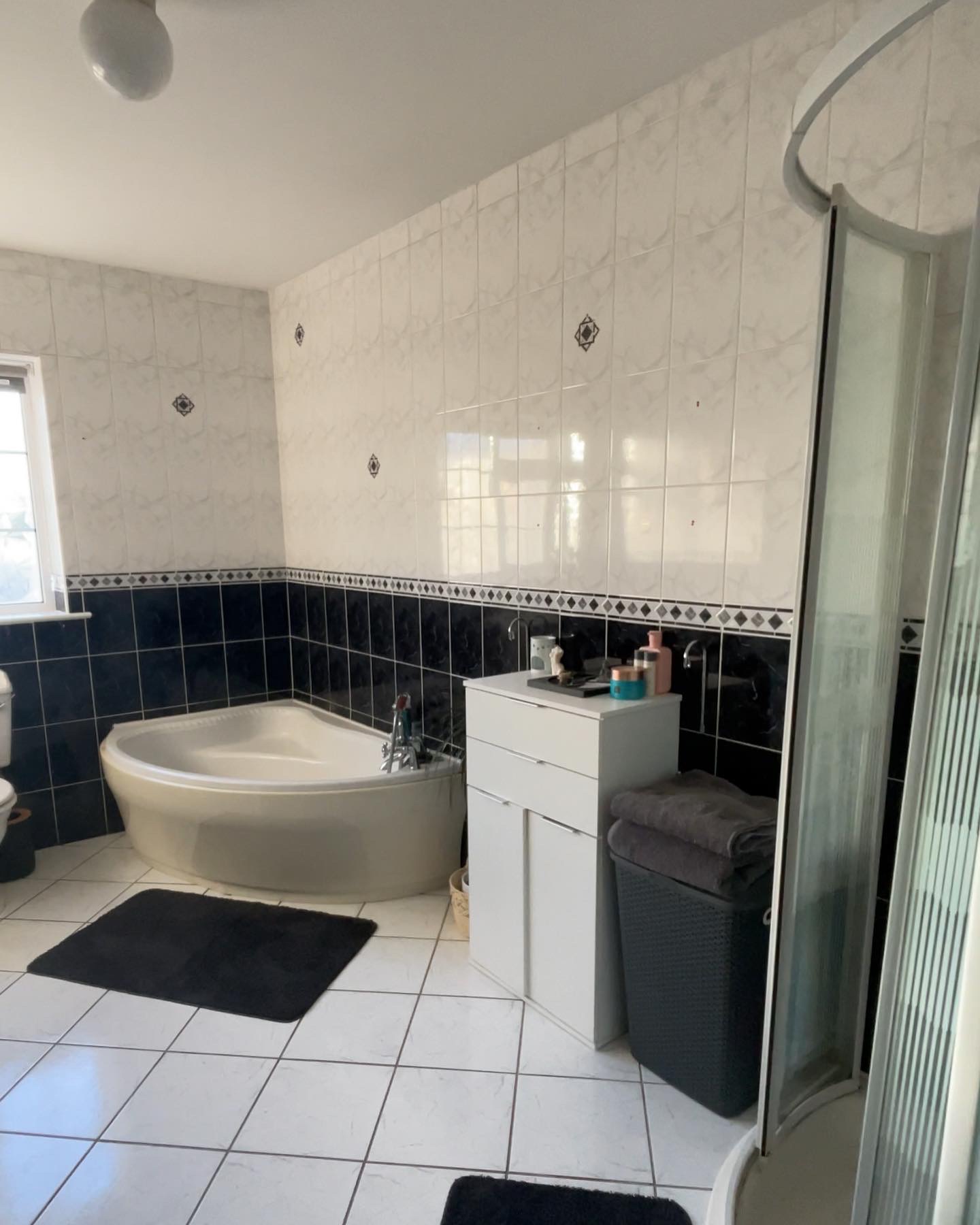
The bathroom décor before the renovation took place.
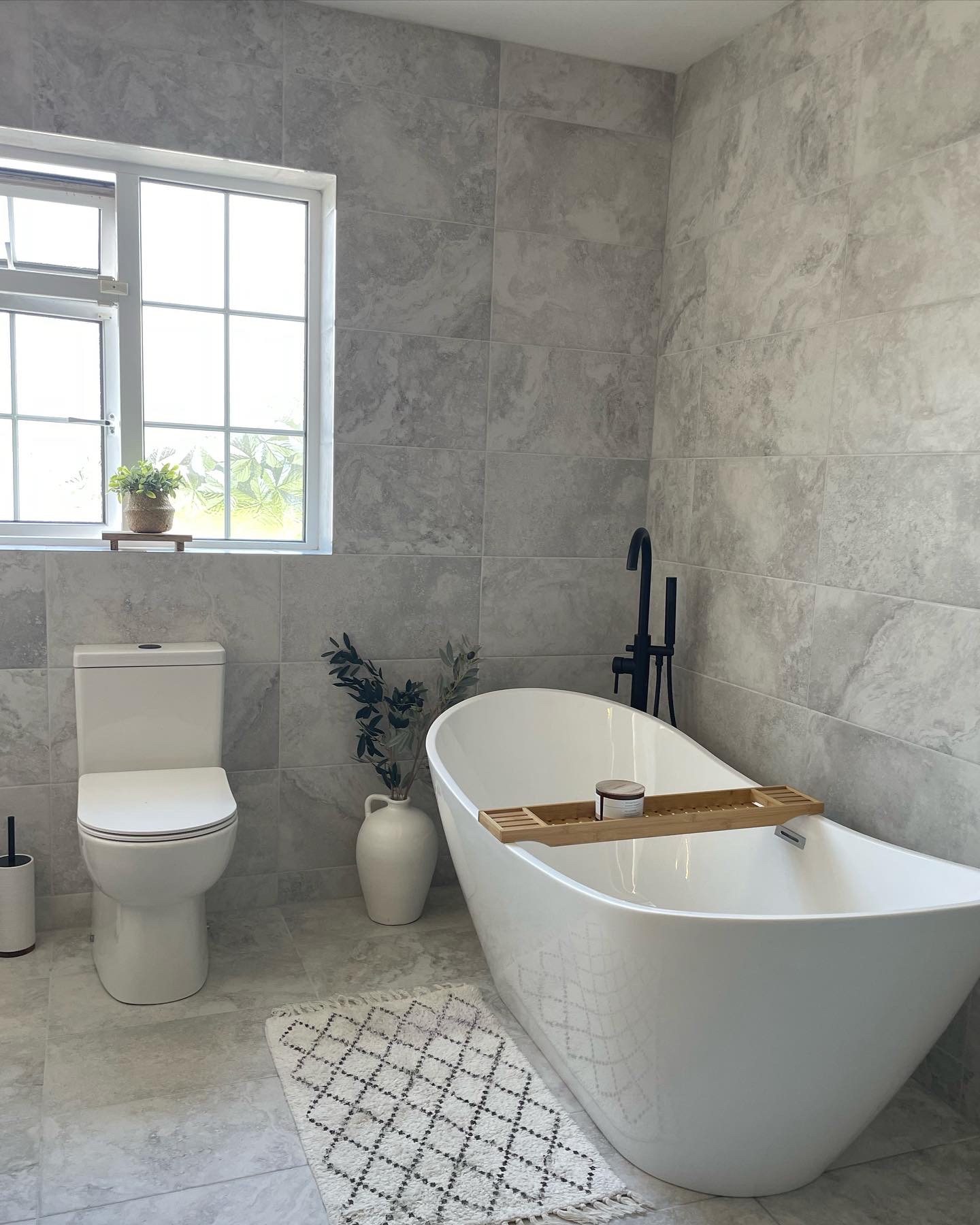
The bathroom post-renovation has a luxury spa-like style.
Natural stone and wood-effect features
The dominant tiling in the bathroom is subsequently the Chrono White Porcelain Floor and Wall Tile – a large-format grey tile with a matt concrete-effect finish which adds texture and visual interest. This stone-effect tile is used throughout the room, on both the walls and floor, with the Strip Northwood Oak Decor Rectified Tile then creating a feature wall behind the vanity area.
Complementary wood accents are also evident in accessories like a wooden bath caddy, while the vanity unit – the Josef Martin Urbano Space-saver Floorstanding Two-door Vanity Unit in Dalton Oak is also wood-effect, though in a contrasting darker tone than the tiles behind it. This is fitted with Bathshack’s Minimalist Thin-edged Basin, with matt black accents appearing in the Eliseo Ricci Vesu Basin Mixer and Eliseo Ricci Press-top Slotted Waste, along with the Josef Martin Campana Handles.
“Even when we were in the showroom, I put the two tiles together to make sure they looked nice together,” said Kitti. “It all blends very well and we’ve had loads of compliments from people who think the wood-effect tiles are real wood.”
The matt black features at the vanity area are continued in the shower, with the shower kit Bathshack’s Eliseo Ricci Noir Cube Plus Thermostatic Rain Shower with Diverter in matt black. Meanwhile, the surrounding wet room screen is the Hudson Reed Framed Wet Room Screen in Matt Black, also from Bathshack. The Hudson Reed Wet Room Swing-screen in Matt Black is further used, to give added protection while the shower is in use. The freestanding bath tap – Bathshack’s Eliseo Ricci Noir Curve Floorstanding Bath-shower Mixer – also has a matt black finish, so everything works together to create an interior with a cohesive theme.
Focal point with freestanding bathtub
As for the main feature in the room, Kitti and Shaun's bathtub - the Viktor Benson Arabica Freestanding Double-ended Bath from Bathshack - this creates a striking focal point and was the first piece of furniture they chose, after the tiles.
“The bath is the first thing you see when you walk in,” said Kitti. “It’s such a nice feature. “We started with that, after choosing the tiles and paired it with the black freestanding tap, matching everything else up from there. We wanted the bathroom to feel like a spa – a place where you can relax, as we both enjoy going to the spa.”
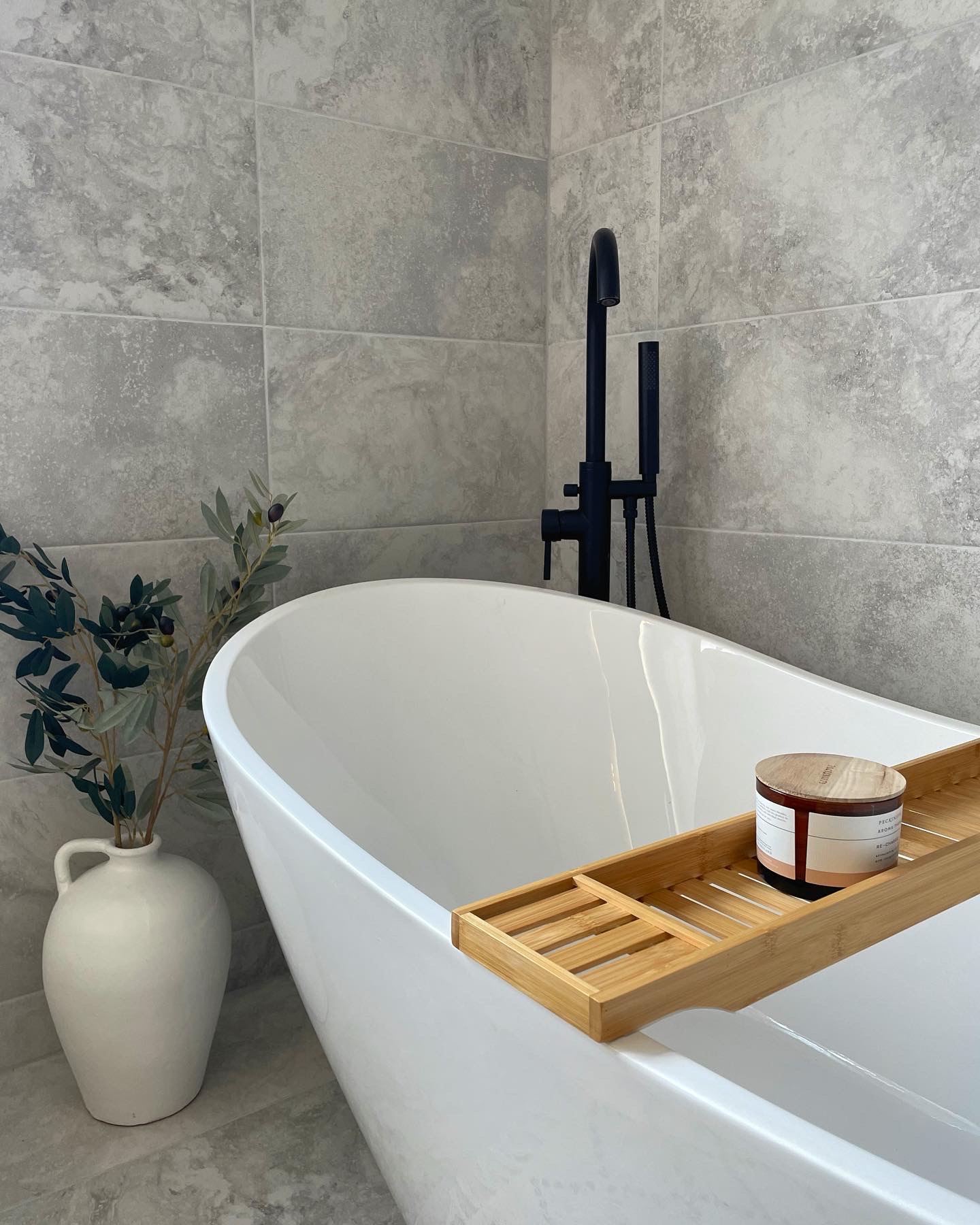
The Viktor Benson Arabica Freestanding Double-ended Bath is a focal point in the bathroom.
With a sleek, organic aesthetic, the bath has a modern slipper design, with raised ends giving the option of bathing at either side of the tub. It also has a deep, luxurious shape and a smooth gloss finish in classic white, resulting in an opulent style which fits in perfectly with Kitti and Shaun's relaxing hotel/spa-like theme. The matt black bath-shower mixer subsequently provides an elegant contrast to the bath and gives it a contemporary edge.
The toilet – similar to Bathshack’s Enzo2 Close-coupled Fully Back-to-Wall Toilet and Soft-close Seat (please note: the exact product purchased is no longer available) – is also in classic white and has a modern design with an ultra-slim soft-close seat. It’s also fully back-to-wall, so all pipework is concealed, for a tidier aesthetic and easier cleaning.
"It's definitely a lot easier to clean around this toilet and it's also nice and neat, with a comfort-height and silent flushing," said Kitti.
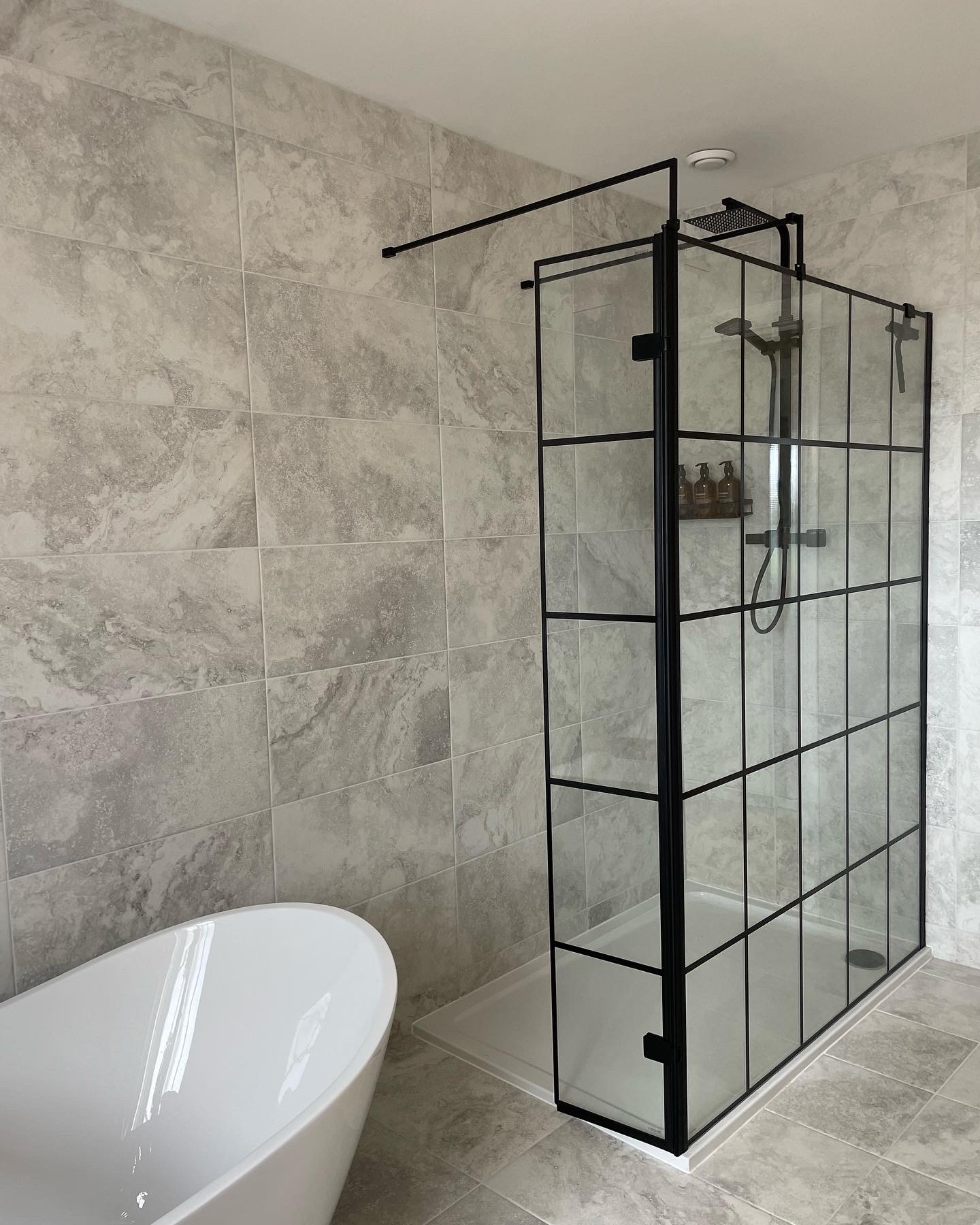
The bathroom features matt black accents in the shower and other fittings.
“We’re very happy with the bathroom,” said Kitti. “We did it all on a budget and tried to get friends and family to help with things like the plumbing and tiling. Shaun also removed all the old tiles himself and did the electrics. We tried to save money where we could."
“We both have a very similar style, which is very neutral and homely. Most of my inspiration for the house décor came from Pinterest, especially with the bathroom, where I wanted it to feel like I was in a hotel – somewhere you could escape to, like a spa. That’s also why I added the greenery in there.”
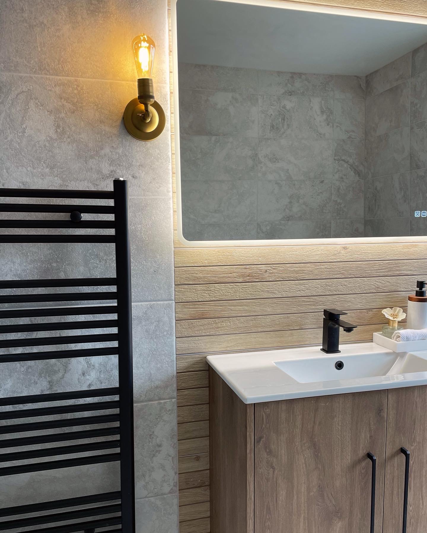
The bathroom has wood-effect tiling behind the vanity unit, with wood also featuring in the vanity itself, along with more black accents in the bar handles.
Kitti added that she had also researched the trending matt black look before purchasing these items, as she had originally been unsure of how to maintain them. However, she had since discovered that gentle cleaning was all that was needed and said she was glad they’d opted for the black, as it had made “such a big difference in the room.”
As for the couple's experience with Bathshack, kitti said that, once they'd visited the showroom, gone home to think things over and then decided what to buy they'd simply ordered what they needed in-store and had it delivered.
“Overall, it was a really great experience,” she said. “We’re really pleased with how everything looks!”
Kitti's top tips for home renovators:
- Take Photos of products: “Taking photos in showrooms, like we did at the Bathshack showroom in Cork, will help you remember what you saw, as you often forget about things when you get home.”
- Bring samples home: “Taking tile samples is a great idea as these can help you visualise better how they’ll look in your home. It also means you can check the lighting and how they look in that, which can be different in your home to a showroom.”
- Research online: “I found lots of inspiration on Pinterest, where you can get lots of good ideas.”
- Define your style: “If you know what vibe you’re going for then that helps a lot. For example, we knew we wanted to create a hotel/spa-like vibe in the bathroom, so we knew to look for things that would match in with that.”

Molly and Toby, who paws-itively approve of the neutral colour scheme in their home.
You can follow Kitti and Shaun on Instagram at @our.home.in.carrig
View our Bluetooth mirror range online at bathshack.com or call into your nearest showroom to see what we have. Alternatively, if you have any questions, just email our team at info@bathshack.com or you can call us on (028) 9077 0188 or use our online chat.
